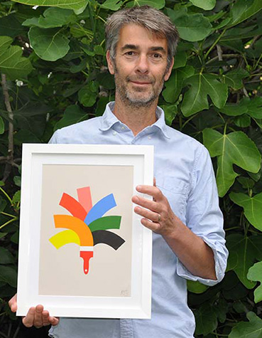
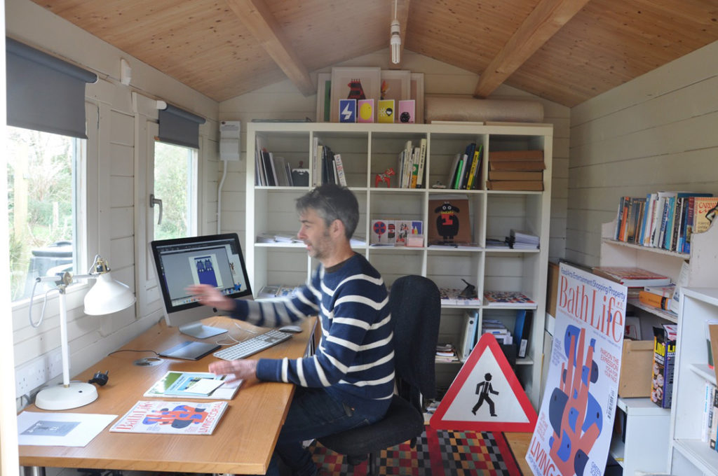
Artist Andy Goodman
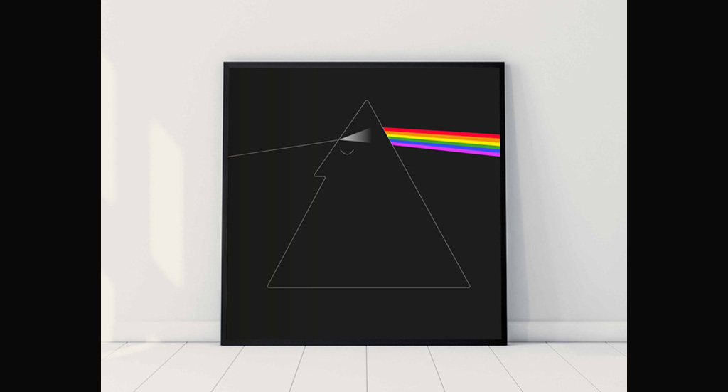
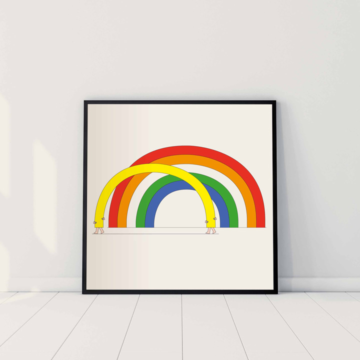
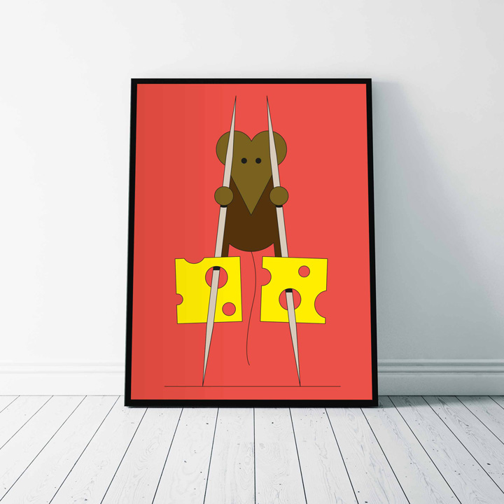
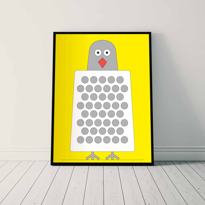
Bold colours, fine lines and a smile in your mind
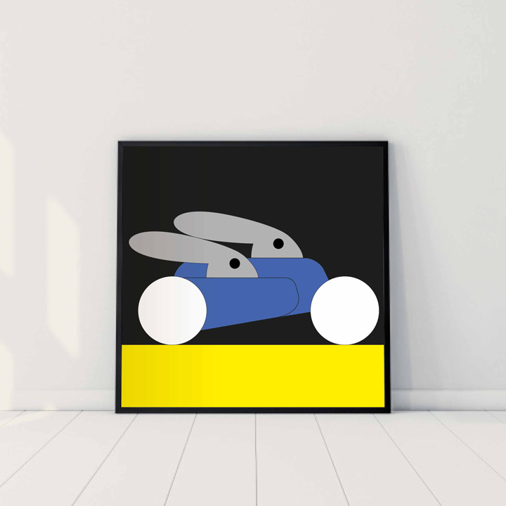
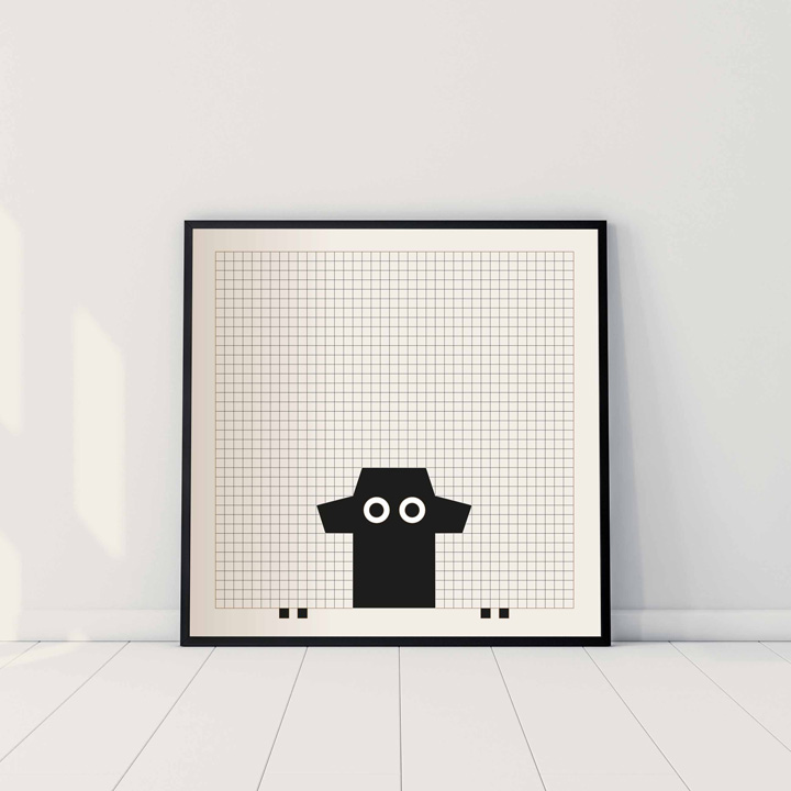
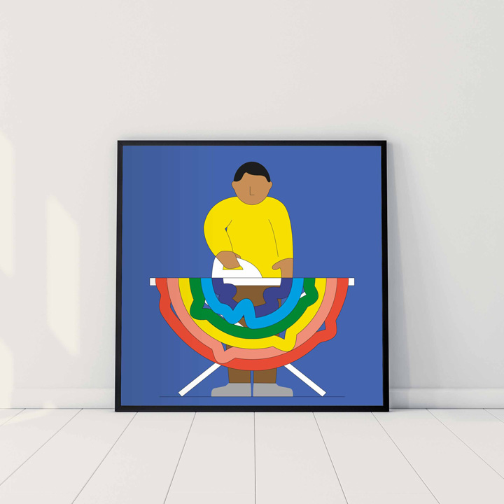
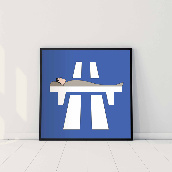
Bold colours, fine lines and a smile in your mind courtesy of Andy Goodman

»’A Smile in the Mind’ is still my graphic and illustrative bible.«
What visual influences shaped you as a child? What provided the initial impetus for you to think visually and start drawing?
My year 7 classroom doubled up as the school library, so my love of books and the art contained within probably took off from here. I remember writing out texts, usually about space or underwater exploration, and putting them into layouts with my own simple line drawings.
My biggest influences were the 1970’s fiction and non-fiction books from Ladybird and the city of Cambridge with its university art gallery, Kettles Yard and the All Saints Garden Arts and Crafts Market of which my mum was a regular stall holder. She made rag dolls and pressed flower pictures.
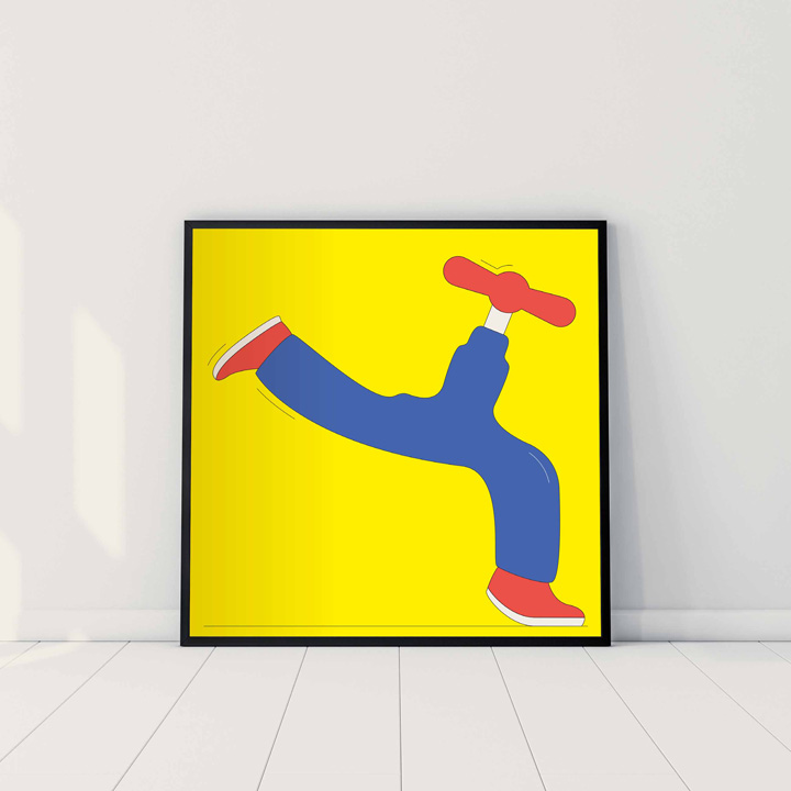
You work with strong colours and use a very graphic, clear stroke. Has this always been your style?
My style stems from 20 years working as an editorial designer for newspapers and magazines. Their strict use of grids, layout guidelines and typographic treatments must have rubbed off but I’m always searching for more illustrative routes.
Your illustrations are often wonderfully subtle commentaries on all walks of life. Are they consciously initiated, or do they usually happen more by accident?
This is a fascinating area and one I often reference from my graphic and illustrative bible, ‘A Smile in the Mind’, which focuses on the generation of ideas. Mine are either the very first ones or yes, born out of accident. I find these ‘accidents’ are best discovered with all senses primed, there’s a greater chance of finding them with eyes opened and ears peeled!
You have already published several books. Which one is your favourite?
‘It was so quiet I could hear a pin drop’. This book uses Victoriana so visually it’s not in keeping with my current work, but it does have a favored mechanism; an escalation of sounds reading from the very quiet (a pin) to very very loud (an exploding volcano).
Some say that British graphic design is defined by a unique sense of quality and finesse. Do you agree?
I think it was easier to define British design in the 1950’s to the 70’s with the likes of Alan Fletcher, Tom Eckersley and Terrence Conran. Then it stood out but today it’s more difficult as distinctive work comes from across the globe.
Having lived in London for many years with your wife and children, you moved to Bath 7 years ago. Bath is home to artists like Peter Gabriel or Roland Orzabal. Do you feel comfortable here or do you sometimes miss London and its design scene?
I thought I’d miss London but actually I don’t. Apart from the friends we made there, I was happy to leave the metropolis behind and I think my work has benefitted from moving to Bath.
Please tell us more about your current project “Bristol Faces”. What is the idea behind it and how many different images did you create for this project?
The Bristol Faces are being used to represent popular landmarks and curiosities such as the Cheese Lane Shot Tower and The Bristol Hippodrome. Having been depicted a million times already, there was a need to approach them differently so my landmarks have faces or incorporate a random element.


Thank you, Andy!


Join our Community