Alf Button’s Revenge
The amazing second life of pop culture
Alf Button’s Revenge – The amazing second life of pop culture

»The Clash’s ‚London Calling‘ and The Jam’s ‚Sound Affects‘ both broke away from ‚the picture of the band, title‘ ideal.«
Have we correctly identified a reference to a 1920s novel by William Darlington, ‚Alf’s Button‘?
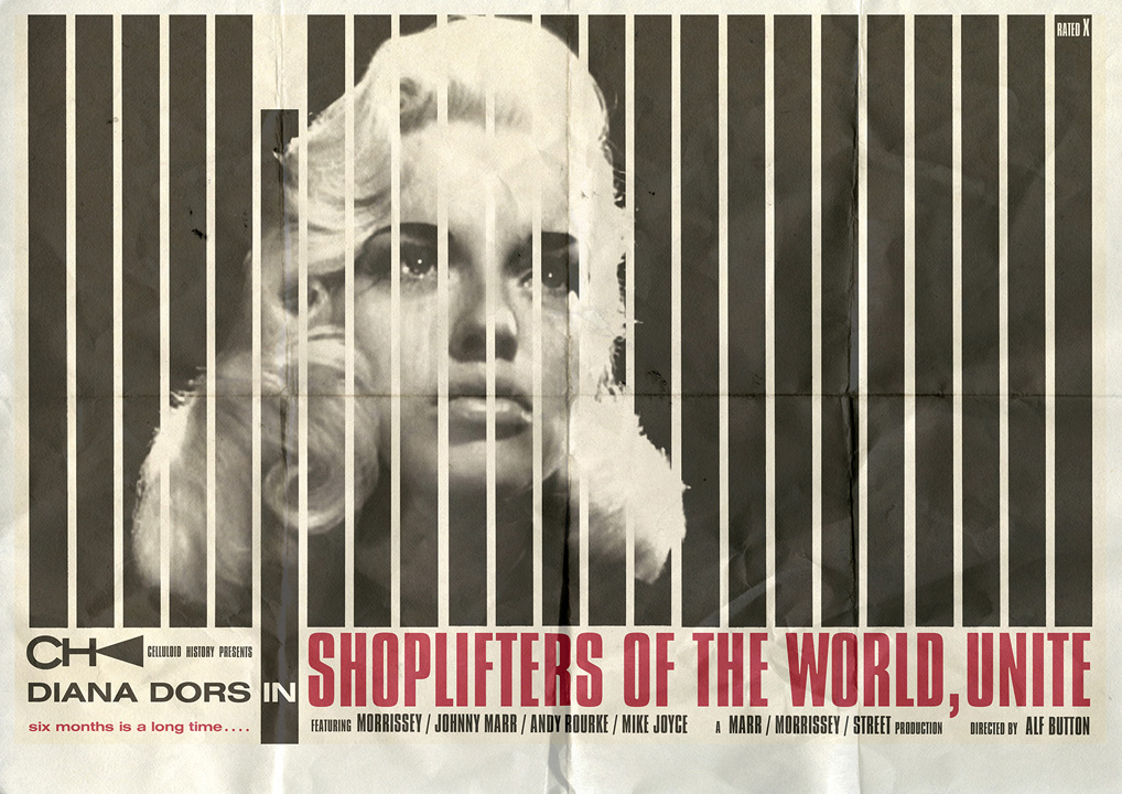
The name Alf Button was used by Morrissey in an NME article from the early Nineties, I was unaware of the novel, but was drawn to the absurdity of the name.
When and how did your design journey begin?
I’ve always been interested in the aesthetic, be it an old Ford Cortina, Eddie Cochran’s guitar or my Father’s shirts. I’d seen ‚art‘ everywhere. I hoped to be a signwriter as Typography had always intrigued me, but the dream faded …
What has particularly influenced you visually and culturally? Was there an iconic piece of design (book, album, etc.) that triggered you in your youth?
My Grandmother would clip images from magazines and newspapers and paste them into old catalogues, basically anything that she found pleasing to her eye.
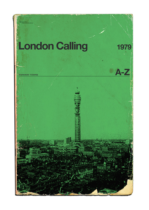
I would pore over these random scrapbooks as a child. I have done the same throughout my life collecting scraps of paper, and obviously, more recently right clicking and saving. Many of the album and single sleeves from my early youth seemed perfunctory, but the Clash’s ‚London Calling‘ and The Jam’s ‚Sound Affects‘ both broke away from ‚the picture of the band, title‘ ideal, and, although revisionist, seemed much more interesting.
Of course there were more sleeves out there, Elvis Costello’s ‚Almost blue‘ being one my favourite sleeves ever, but my eyes were not fully open yet.
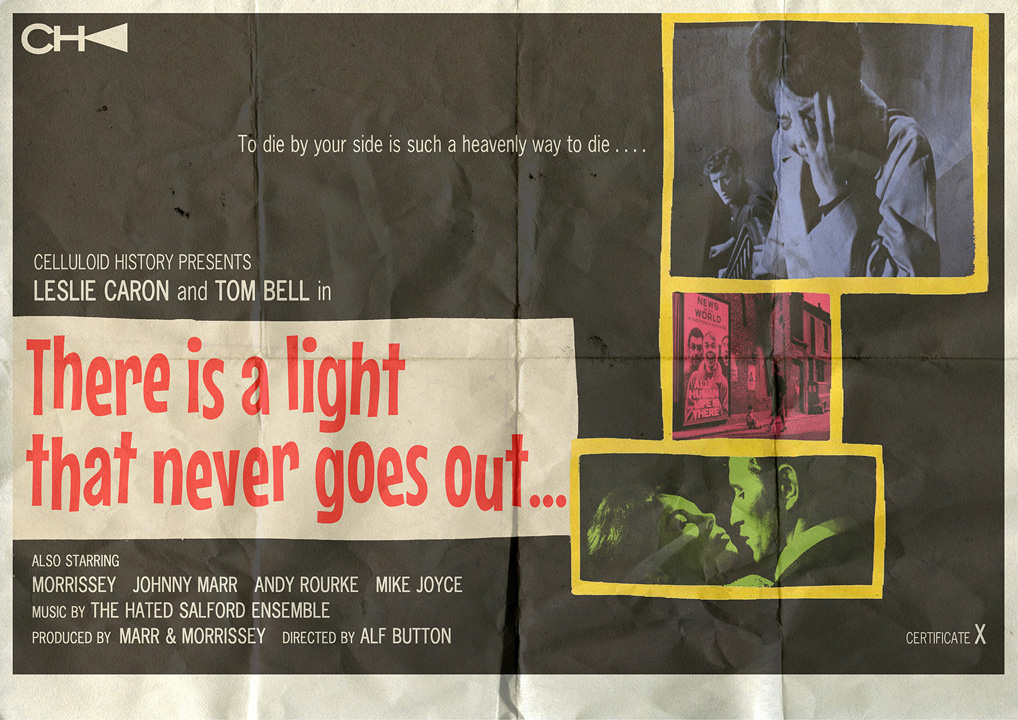
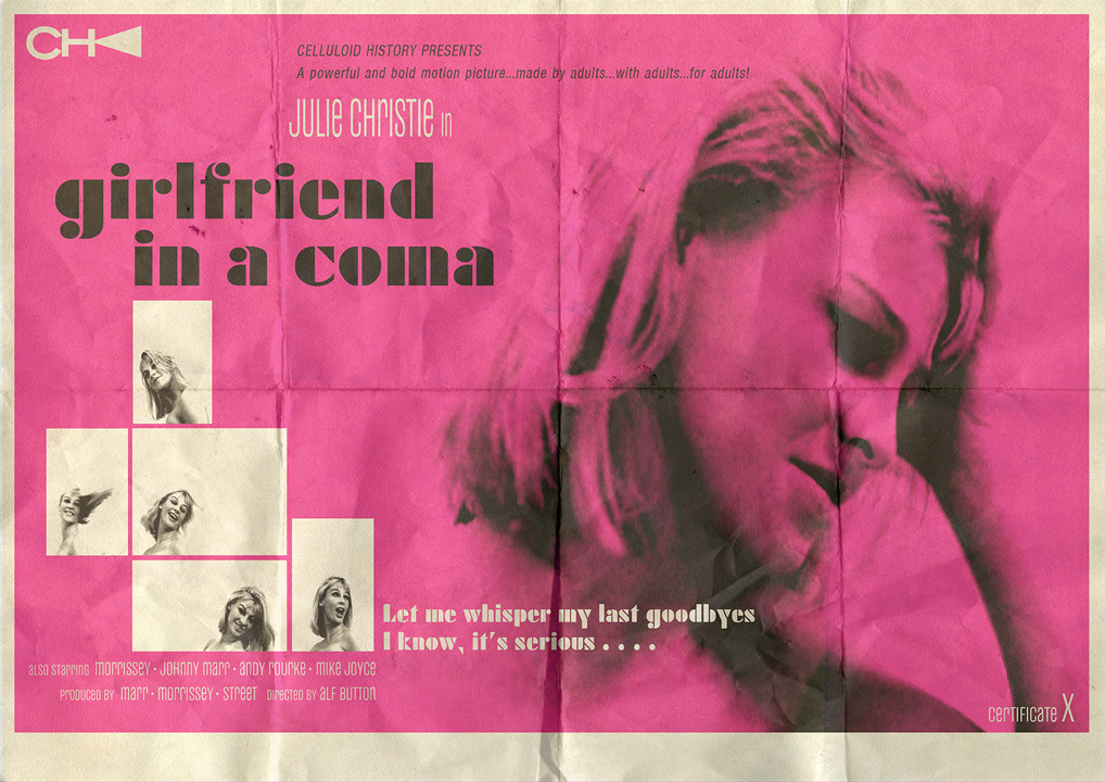
You turn songs into book cover and films into LP cover. How and when did this wonderful effect happened?
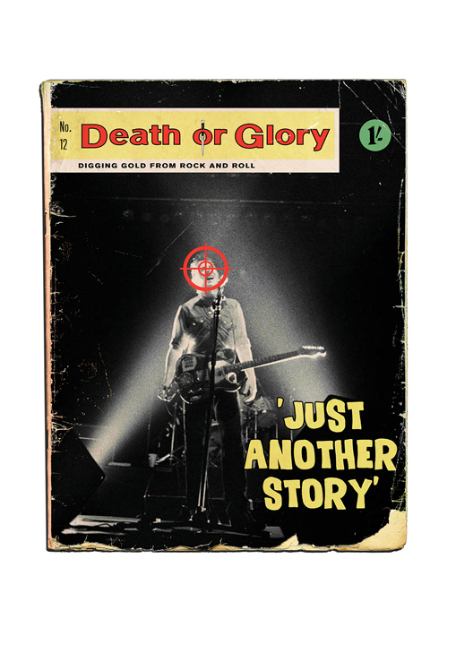
I started with trying to encapsulate a whole lyric into a single image – not necessarily an obvious image, but something the lyric evoked. This developed into trying to present songs, icons, films, etc. into wholly different mediums. There is so much art out there, so you try to carve your own little niche….
Your design mostly references the 50s, 60s and early 70s (unless we have missed something). Will this remain your preferred frame of reference or can it also be expanded into other decades and styles?
I don’t want to totally dismiss the modern, but taste and style seem to be diminishing. Everything is ugly nowadays – cars, buildings, clothes, advertising. l was born in the late 60’s and personally remember the 70’s as a very drab decade, drenched in brown and orange, so I realise a lot of this longing for the past is very idealised.
The Smiths sleeves from the 80’s also harked back to the past, and they clearly had a huge influence on my ‘style’, and the aforementioned Almost Blue sleeve by Barney Bubbles also referenced Reid Miles’ cover design for Midnight Blue by Kenny Burrell. So the past is still worth mining.
The finishing touch to your work is the refined addition of traces of use that create a perfect illusion. Did you start with this design aspect from the beginning or did it develop later?
I wanted the work to seem like ‘found pieces’, loved and lost or simply undiscovered. lt has evolved over time and is almost my default setting when starting a design nowadays. I think I initially used the effect to obscure the poor quality of an image I was using!
Are there book or album cover designers that you especially like?
Reid Miles, who designed many of the Blue Note LP sleeves, is the one constant. l’m inspired by artists and photographers as much as designers, such as Piet Zwart, Harland Miller, Roger Mayne, Peter Blake and John Bulmer.
Can you name some of your favourite album or 7inch covers from your personal collection?
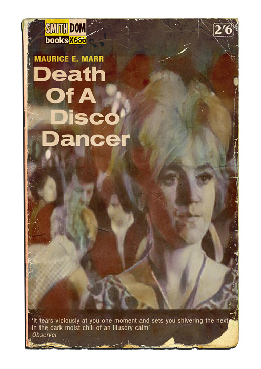
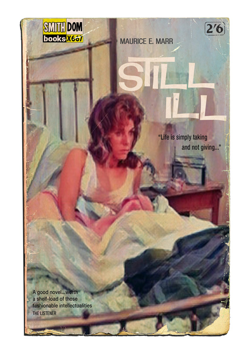
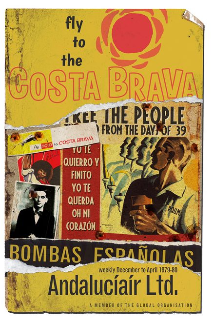
Virtually all of The Smiths canon, Morrissey’s use of imagery, colour and old typefaces was somewhat radical at the time, compared to all the other fare on offer. You could always spot a new Smiths release in the racks at Woolworths because it looked like nothing else. The Smiths sleeves forged an unmistakable identity, something which Suede also did a few years later, to good effect.
London Calling – I was aware of the Elvis allusion, but it didn’t matter. Sound Affects – again a sleeve which takes from the past as a reference, the BBC Sound Effects LP’s. Searching for the Young Soul Rebels by Dexys, The Beatles For Sale, Hunky Dory by Bowie …
The seven inch singles Start! by The Jam, which inspired my only tattoo, Something Else by The Sex Pistols, Too Much Too Young by The Specials, Popscene by Blur … all records that you can’t imagine having any other sleeve, the artwork just adds another dimension to the story and the songs within.
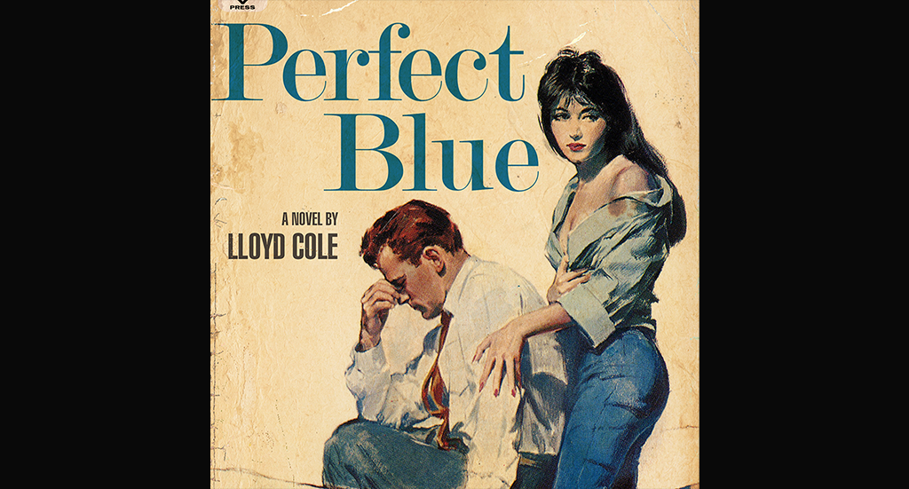
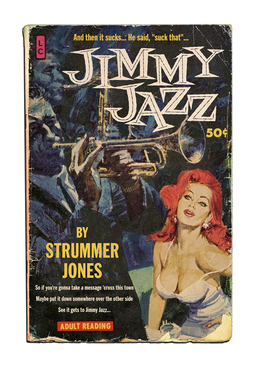
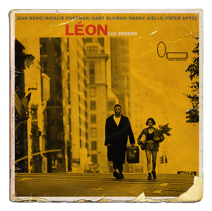
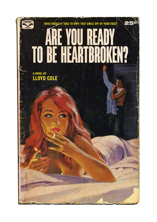
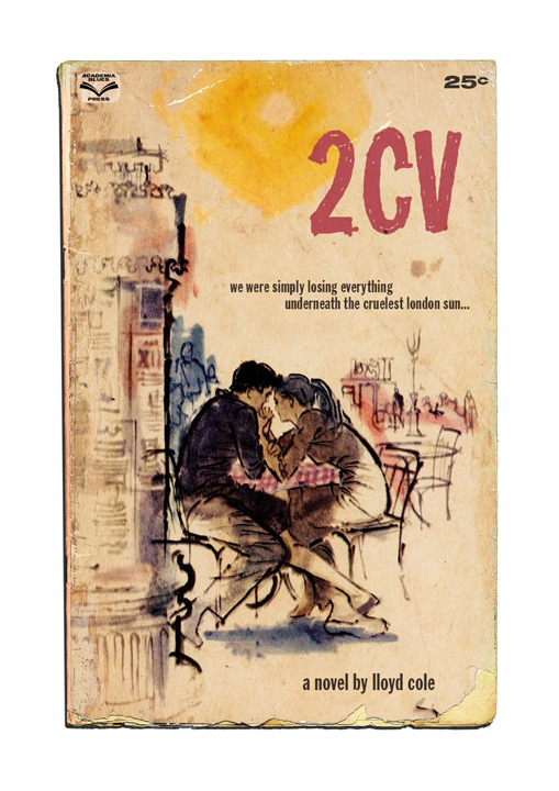
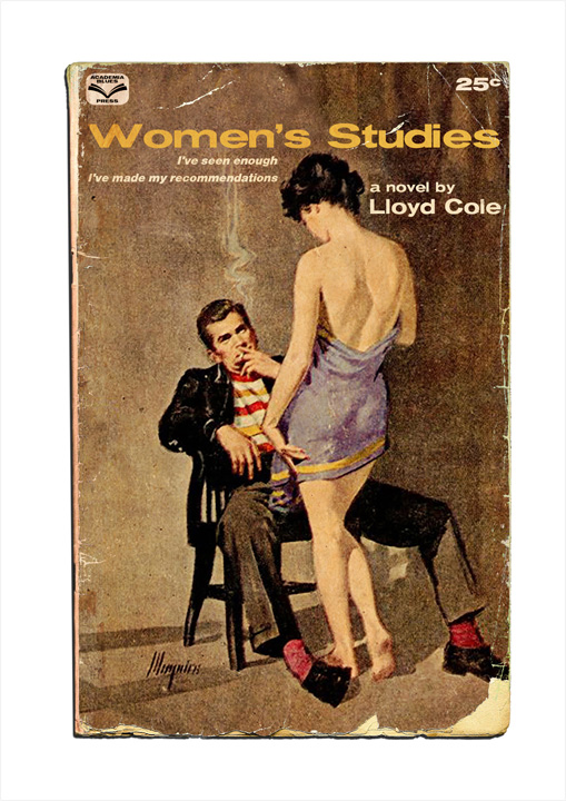
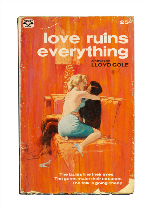
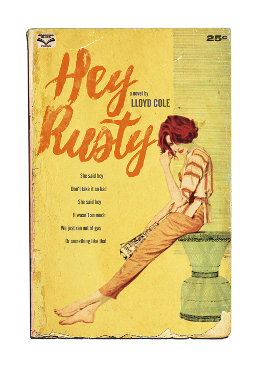
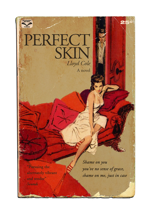
You chose brilliant pulp fiction illustrations for a lot of your Lloyd Cole (and the Commotions) interpretations. Did you adapt them or create them from scratch? (… and where did you find them?)
I trawl the internet gathering suitable images, which I then adapt and amend if needed. I liked the idea of songs becoming novels, or short stories, and Lloyd’s literate leanings were ideal for such a notion.
Lloyd Cole is selling your postcards on his website. Did you ask him or vice versa? How was his initial feedback?
l’d occassionally send Lloyd designs to be used online for upcoming tours and such. l’d sent him a few of the pulp novel ideas and he suggested selling them through his page, from that I surmised he liked them.
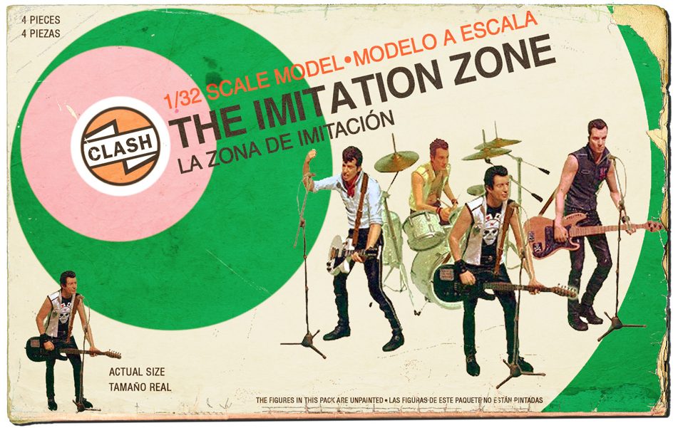
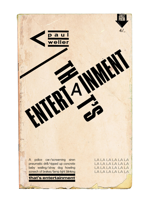
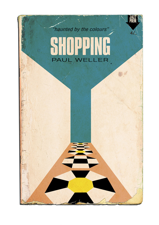
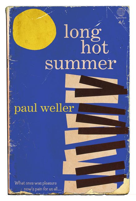
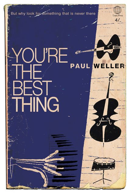
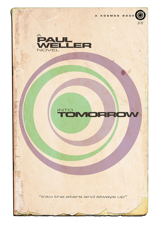
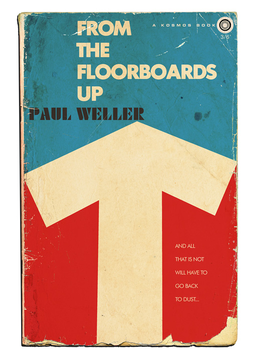
Have you ever received feedback from Paul Weller, Mick Jones or other artists that you featured, by the way?
l’ve been told that Weller has seen some of my work, and digs it!. l’ve never heard from any other artists, probably because I haven’t got a fax machine…
One artist’s merchandisers requested some pieces be removed – for reasons known only to themselves, as they didn’t respond to my missives!
What other or new projects are you currently into? Do you plan an exhibition somewhen in post-covid times?
l’ve been trying to do justice to Bowie for a long time, and l’ve almost completed a Small Faces set. An exhibition is something l’d like to realise whilst still alive.
What music are you currently into?
I very rarely challenge myself with ‘new’ music, l’m a habitual creature … Weller’s Fat Pop, Nick Waterhouse’s Promenade Blue, Michael Kiwanuka, The La’s, Lloyd Cole and a compilation I made featuring Baby Huey, Eddie Floyd, Nolan Porter, Darrell Banks and more.
Thank you, Alf!
P.S.: if you are interested in Alf’s artwork please contact him via the links below.

Join our Community